Sign In or Create New Account

Remember me

Connect

The Story Board
Previous
Next
Sort Stories
Top Stories Most Recent
  |   Stories Main View   |   Stories I follow   |   Stories I've Shared   |   Favorite Stories   
 Title 
Title Author Description

MMDT Challenge #10: Glorious Orange! Fabulous, fruity and fun!

MMDT Challenge #10: Glorious Orange!


POST WINDOW: May 15 - 21st.


Choose a Color and let it inspire the photos you take.


Tell us:

  • About the photos you took.
  • Why did you choose the color?
  • How does the color make you feel?
  • What does the color make you think about?


I chose orange because it’s one of my favorite colors. I’m sure it has something to do with the décor in my house when I grew up. Born in 1970, my house was decorated in the 1960s…orange furniture, orange carpeting, orange curtains…it must have seeped into my soul.
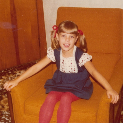


ORANGE makes me feel fabulous, fruity and fun! It’s also retro, refreshing and rejuvenating! So when I thought about where to take my photos, I thought what better place than the grocery store? I must say I got some strange looks as I posed the produce and cans of soda to get a good shot! One of the grocers eyed me…an older gentleman…he said he thought he’d seen everything when his wife took pictures of all the food at the last cruise they went on. He wasn’t ready for Tami’s challenges!
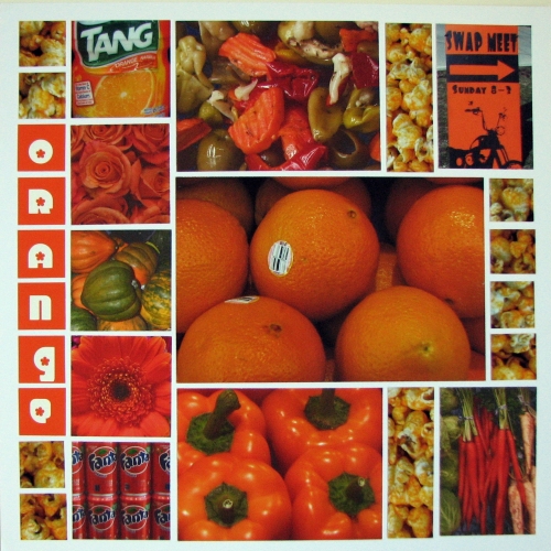


I used white grid paper so that all the different shades of orange could stand out. I couldn’t find any stickers that I liked, and I tried making an overlay title on a transparency for the large focal picture, but it didn’t look great. I couldn’t find any letter tiles that would work with my motif, so I decided to make my own 1” photo tiles with the letters to spell out o-r-a-n-g-e! I made 1” square text boxes in MSWord, color-filled them with orange and added white letters. I used a retro-looking font called CHICK, printed on photo paper and cut out…voila!


I used Page Pattern #40 www.tamipotter.com on its side. I knew I wanted to open up my bag of Oke-Doke cheese popcorn, take a photo and cut it into 1” squares, so I chose a pattern that had room for some 1” square tiles. And it was delicious!


So, between the floral department, the fresh produce, the olive bar (jardinière picture), the soda aisle and a bag of cheese popcorn…there you have it! My glorious orange inspired page. Oh, and on the way out, the swap meet sign was propped up against a telephone pole at the intersection!


Thanks for stopping by!

Shared by Heather Cartland on May 15, 2013 | Memory Date: May 12, 2013
Follow Heather Cartland
Cheer Me On
Love it ! 3
LOL! 1
Heartwarming! 0
Yummy! 2
Great Job! 0
Wow! 2
Beautiful! 0
Thnx 4 Sharing 0
Made Me Smile 0
Click an Expression to Cheer Me On.
Story Cheered By:
Comments
LOVE, LOVE, LOVE the picture of you in the orange chair-too adorable!! Great color you picked! You really took great photos of different things that were orange. I am really digging the "orange" lettering down the side! Nice job
Posted By: Shannon Nixson  |  June 7, 2013 at 11:53 pm   
I love this! What a great collection of orange.
Posted By: Candy Spiegel  |  May 29, 2013 at 9:26 pm   
This is a great color. You really did a great job at the market. I wanted to do the same, but I felt wierd shooting fruit and veggies. Your page is so chock full of goodies. Great job.
Posted By: Dale Hill  |  May 28, 2013 at 2:27 am   
This is totally, awesomely, undeniably incredible. What a great idea and warm, fuzzy color. You tied it all together incredibly well. While the oranges add wonderful texture, I'm drawn to the shiny peppers . . . This is great.
Posted By: Diane Cook  |  May 23, 2013 at 6:06 pm   
Heather - love the retro photo! Can almost feel the orange shag carpet under your feet. Beautiful layout and what a great idea. Makes the ordinary extraordinary :)
Posted By: Julie Oconnor  |  May 22, 2013 at 2:07 am   
Great choice Heather - and the picture of the Fanta literally makes me laugh out loud. While getting pizza at a local eatery my son is filling his cup with Fanta from the fountain he turns to his dad and says "so they call people who drink a lot of alcohol alcoholics, since I drink a lot of orange soda does that make me fantasic?" Good thing I wasn't taking a drink at the time!! Thanks for bringning back those memories!
Posted By: Tonnya Sayah  |  May 21, 2013 at 1:11 pm   
Congrats on conquering the grocer! I was not so lucky this time...I was shooting while shopping and was told to stop "it's company policy" I mean seriously...doesn't this guy see the emails on the internet about his shoppers??? Anyway Heather, you have done a fine job of making orange look good! Maybe it is all the food :) I love the use of the cheese popcorn as a series of tiles. Great Job!
Posted By: Andrea Fisher  |  May 21, 2013 at 12:34 am   
Heather, I laughed out loud when I saw your layout and called my friend to come look at it right away. I had the exact same idea of going to the store and photographing the oranges, carrots, etc... but when my flower show photos didn't turn out, I scrapped "orange". It is so amazing how many of us think alike and have a lot in common! Anyway, I love your page and the fact that you went and took those photos! My bedroom was orange growing up, so I've always been an orange fan! The layout itself is so clean and crisp...really nice job! P.S. You were adorable>>>still are for that matter! :)
Posted By: Lori Hanson  |  May 21, 2013 at 12:32 am   
Orange is a happy color. I love that you bravely went into the grocery store and took your shots. I love the font you found. The little flower reminds me of the navel on the orange - perfect choice.
Posted By: Tami Potter  |  May 16, 2013 at 4:14 pm   
     

Terms of Use | Privacy Policy | Contact Us © 2024 Journella LLC

Help us Grow on Delisous Find us on Facebook Follow us on Twitter