Sign In or Create New Account

Remember me

Connect

The Story Board
Previous
Next
Sort Stories
Top Stories Most Recent
  |   Stories Main View   |   Stories I follow   |   Stories I've Shared   |   Favorite Stories   
 Title 
Title Author Description

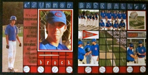
Summer Baseball

Our second challenge for July was to use navy grid paper and  pattern #60.  

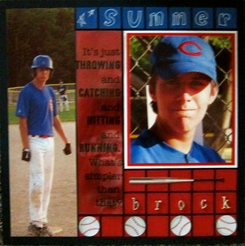
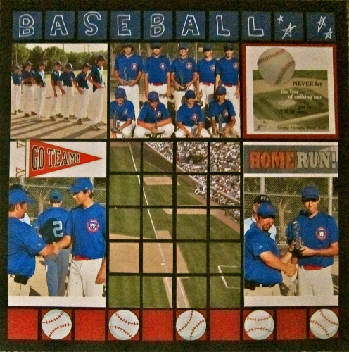
I chose to use some pictures from my Grandson Brock's baseball season, because I thought the blue of the uniforms would look good with the navy grid paper.  I really hadn't planned for the whole look to be red, white, and blue, but these pics were taken near July 4th, so guess those colors would be appropriate.  (They are seldom inappropriate!).

I didn't have many pictures, so I had to use several "fillers" to make up the 2-page spread.  

One of the choices was to use doodling, so I drew my own letters and added "homemade" stars.  I had never done letters before, but I was fairly well pleased with the way they look.  I didn't even practice before making them.

I had been looking for a way to use the 4 x 12 picture at the left on the first page, and it seemed to fit this layout very well.  The quote to the right of it says:  "It's just throwing and catching and hitting and running.  What's simpler than that?  Actually, when I was growing up, and we played baseball in phys. ed. class, it was NEVER simple for me.  I swung at every pitch, whether it was over my head or on the ground!

In case you can't read the quote from Babe Ruth, it is:  "Never let the fear of striking out get in your way."  A good motto for life in general. 

My main hope is that my 15-year-old grandson will enjoy my attempt at depicting part of his sports activities.  I am, of course, his #1 fan!

Shared by Linda Holmes on July 20, 2012 | Memory Date: July 20, 2012
Follow Linda Holmes
Cheer Me On
Love it ! 5
LOL! 0
Heartwarming! 1
Yummy! 0
Great Job! 3
Wow! 1
Beautiful! 0
Thnx 4 Sharing 0
Made Me Smile 0
Click an Expression to Cheer Me On.
Story Cheered By:
Comments
The quote by Babe Ruth was great because the first page looks like it is from his era. Some of the photos look like real baseball cards. I love it!
Posted By: Rose Van Cleave  |  August 9, 2012 at 1:11 am   
Great layout - I like how you flipped the page pattern so the mosaic piece was at the bottom of the page. I'm always looking for baseball layouts as I have two grandkids playing - another one to add to my inspiration!
Posted By: Nancy Sanders  |  August 5, 2012 at 5:36 pm   
Linda, Brock should love this! I can't believe how grown up he is. What happened to the little guy that screamed when we took him to the movie, "the Grinch?" Love ya and miss you! You did a wonderful job as usual! I love your work...you are so talented!!!
Posted By: Brenda Eaves  |  July 26, 2012 at 6:49 am   
Baseball was on both of our minds for this challenge! I like how you used your handwriting for the title and the doodled stars. It looks wonderful. The quote on your first page is so great and appropriate. Wonderful photos that you were able to use to capture your grandson's season.
Posted By: Sarah Lewis  |  July 25, 2012 at 3:47 pm   
The red, white and blue works perfectly! I love the layout with the pattern that was assigned but I also like that you added the 2nd page with that great quote and closeup shot of your handsome grandson!
Posted By: Beth Glass  |  July 25, 2012 at 3:24 pm   
I like the way you flipped the pattern upside down - smart thinkin! And I love that long 11" shot down the right hand side. That really sets off the whole layout to me. Very nicely done. (oh, and I did baseball for our upcoming challenge about "summer" - we're really laying it on thick with baseball this year!)
Posted By: Deborah White  |  July 24, 2012 at 2:20 pm   
The red, white, and blue are perfect to depict baseball. After all you are talking about a major sport in the USA! I'm sure that Brock will love what Grandma has shown him doing. I like the 1 inch squares showing the first base line. The baseballs at the borrom are perfect!
Posted By: Georgia Bizal  |  July 23, 2012 at 10:49 pm   
I love your doodled letters and stars - great job! The quote is great and your "fillers" are perfect. Love the baseball border.
Posted By: Tami Potter  |  July 23, 2012 at 11:33 am   
Baseball with out R-W-B? Naw...it's perfect! The blue title at the top and the red and white baseball border at the bottom tie both pages together very well. Flipping the feature page pattern was nice touch, it works well having the mosaic section with the field at the bottom. Love the quotes...the bat over the blocks, and the full length photo of Brock! I'm positive he'll love the page...it's says so much more than random photos ever could!
Posted By: Andrea Fisher  |  July 20, 2012 at 3:53 pm   
     

Terms of Use | Privacy Policy | Contact Us © 2024 Journella LLC

Help us Grow on Delisous Find us on Facebook Follow us on Twitter