
Nature Study in Black and White
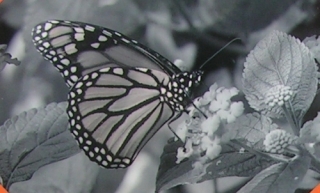 If you saw my projects last year, you will know that I love black and white! Ansel Adams is one of my favorite artists, and I love trying to get shots that I think will look good in black and white.
This year, my husband and I have visited the MN Arboretum a couple of times already. I've been shooting photos of the flowers, the scenery, and the butterflies in their butterfly garden. 
While these photos are beautiful in color, I've found that several lend themselves to black and white reproduction as well. Hence, my "nature study in black and white" title for this MMDT challenge!
For this project, we were also to incorporate chipboard, photo tinting or photo corners. I chose both photo corners and photo tinting, coordinating the colors of my photo corners and mounts with the colors I used in the photo tinting. Here is a list of the corner tile and paper tile colors I used: Paper Tiles: light pink, pewter, white, deep peaches and cream, grapefruit and kiwi. Corner Tiles: deep pink,apple crush, caramel, tangelo blast, and white.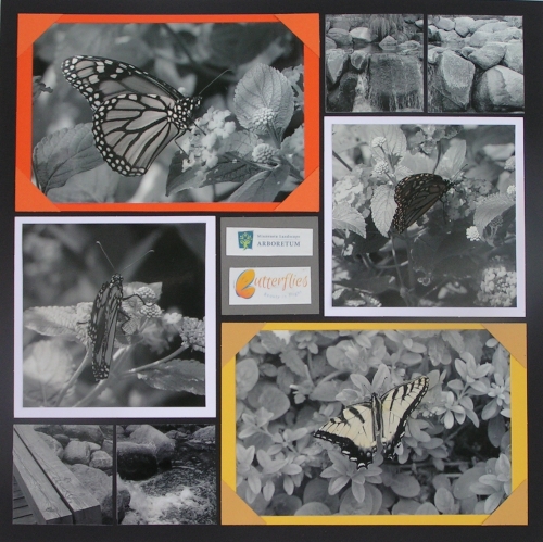
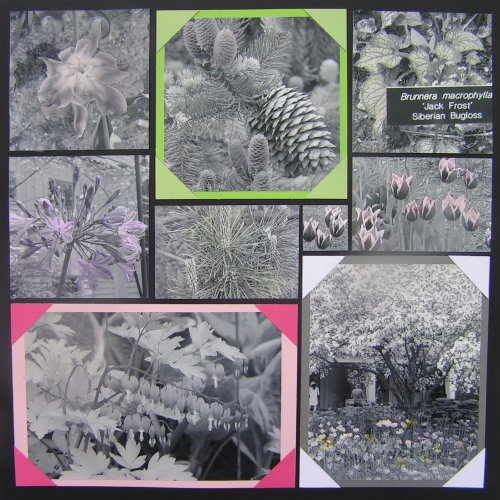
For the photo tinting, I used two different types of medium. First, I used the Stampin'Write markers from Stampin' Up. They are a water based dye ink. I had taken a class a LOOONNNNGGGG time ago on watercoloring on photos, so knew it could be done! These markers worked great for the subtle colors (hopefully these light colors come through on line!), however I wanted a darker purple/blueish color. 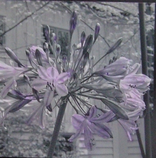 So, I went shopping and picked up some Target brand Watercolor Gel Crayons. I applied a dab to the photo, then did a "wash" with a paintbrush (these "crayons" come with one!) and a tiny, tiny bit of water. This gave me a deeper shade for the darker color on the purple flower.
Also note, you don't need to be "perfect" with your tinting! On these flowers, I just added dots of colors...unless you really look close, you don't notice that they are not perfectly on the petals!
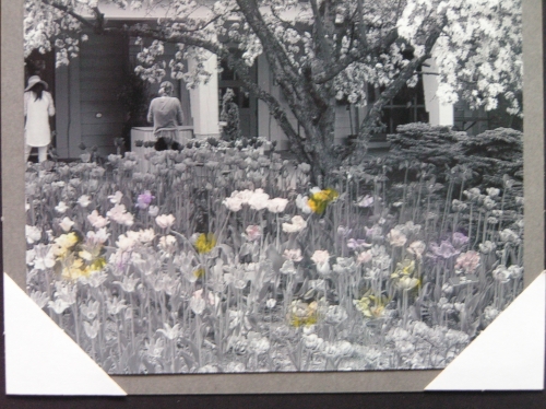
Here are before and after shots of one of the photos:
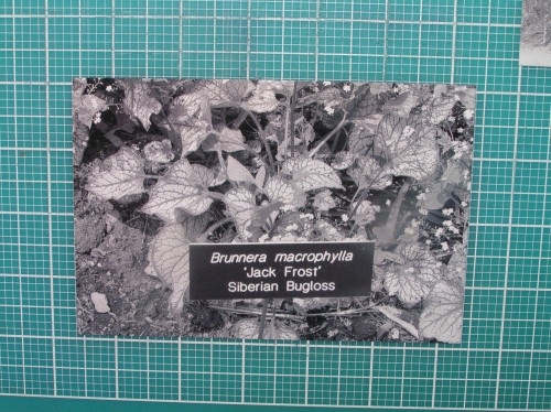
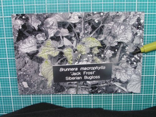
I chose not to tint and/or mount all of my photos. I thought the delicate nature of the bleeding hearts and the monarch with the closed wings would be compromised with the color tinting. 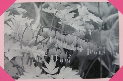
Here is the full layout:
I used page pattern 115 for page one and my own pattern for page 2.
Don't be afraid to try black and white and photo tinting! It's fun!Enjoy!


