Sign In or Create New Account

Remember me

Connect

The Story Board
Previous
Next
Sort Stories
Top Stories Most Recent
  |   Stories Main View   |   Stories I follow   |   Stories I've Shared   |   Favorite Stories   
 Title 
Title Author Description

MMDT #6 Imagine

Claude Monet - Water Lily Pond
 

Vincent van Gogh - Starry Night

This assisgnment was perplexing to say the least.  I have not studied art professionally. So my familiarity with this subject is very small. I checked out the website suggested and found out what I liked.  Monet and Van Gogh were some of my favorites.  Monet for the bright colors and the look of water colors and van Gogh for beautiful colors and interesting brushstrokes.

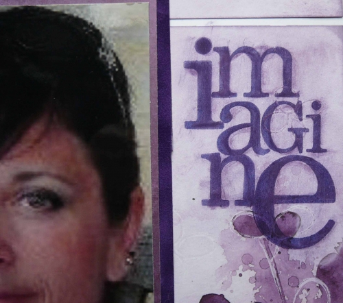
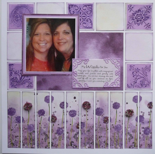
I have a small handful of photos taken with cell phones.  One of those photos of my oldest step daughter is close to my heart. I had it enlarged to a 5x7 at Walgreens and was disappointed it turned out so poorly.  But, I kept it because I truly liked the photo.  When this assignment came up I knew I wanted to use this photo. 

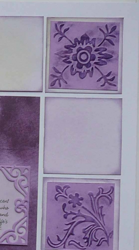
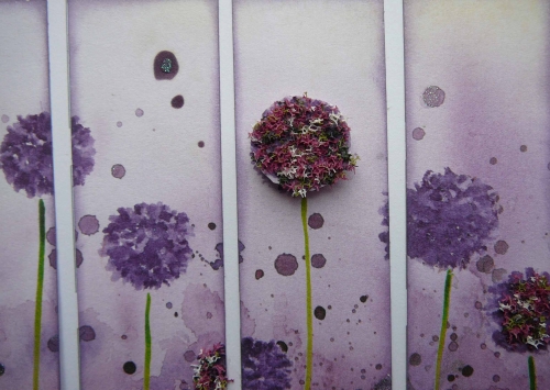
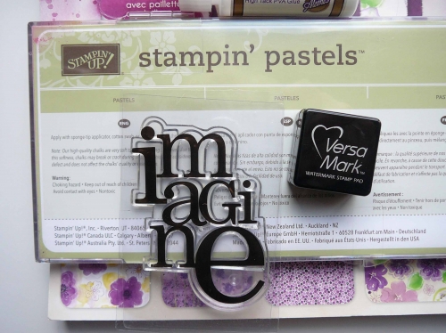
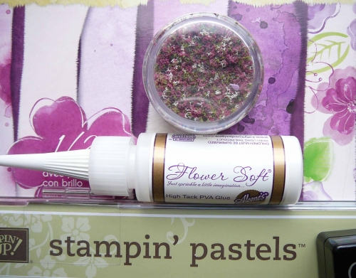
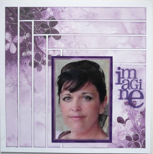
I also like the look of watercolors used in art. Wanted to make my own watercolor paper for this assignment but ran out of time. So after shopping I found some perfect watercolor inspired paper in shades of purple.  Using white grid paper from Mosaic Moments. It took me all night at a crop to do the blank pages without photos on Friday. The page on the left has a log cabin quilt theme with the floral areas of the paper kept intact.  All the edges are inked in purple. The page on the right started with the bottom grid row of flowers followed by 2x2 squares. Just finished this side Tuesday. The left side is my oldest stepdaughter Cheryl and her sister Amanda the youngest on the right.   I used an unknown stamp "imagine" with versa mark ink and then chalked with purple dry chalk from Stampin Up. The right side used Cuttlebug to emboss the 2x2 squares then use versa mark ink on the raised areas and again chalked in dry purple chalk.  The quote used is from Quick Quotes. The bottom grid of flowers to given some dimension used Flower Soft.

After the pages were completed I struggled with where to put the journaling. I was reluctant to cover up any of the log cabin strips and ran out of room on 2nd page.  I toyed with the idea of printing around the white edges, but it didn't seem to fit.  So I narrated what would be there (sometime down the road I will put a letter with these pictures).

"Cheryl and Amanda I am so proud of the beautiful souls that you both are.  Both of you wear many hats from Mom, Spouse, Sister, Daughter, co-worker, friend and Christian. You should be proud of your accomplishments and your beautiful families."  These photos I call my Pixilated Picasso's!


 Thanks for taking a look and hope you enjoy!

Shared by Julie Oconnor on March 20, 2013 | Memory Date: March 20, 2013
Follow Julie Oconnor
Cheer Me On
Love it ! 4
LOL! 0
Heartwarming! 1
Yummy! 0
Great Job! 0
Wow! 0
Beautiful! 7
Thnx 4 Sharing 0
Made Me Smile 0
Click an Expression to Cheer Me On.
Story Cheered By:
Comments
I love your layout!! You did a great job using your favorite artist to create a beautiful piece of art yourself. You should put this one up on your wall. I also love the pattern you used in the first page- so creative!
Posted By: Billi Glenn  |  April 2, 2013 at 6:21 am   
What a great layout! I'm a sucker for Monet and purple so this really resonates with me. And so many techniques that I need to try to incorporate somewhere soon...
Posted By: Libby Wiers  |  March 26, 2013 at 2:51 pm   
The colors are great. The stamping is perfect. Tami is right. You really found a great way to use "not so perfect photos (technically)" with the techniques you used.
Posted By: Dale Hill  |  March 23, 2013 at 2:26 am   
I agree with everyone! Just beautiful! The purple is SO pretty, and you did a great job with the stamping, chalking and embossing. What a fabulous tribute to those women!
Posted By: Lori Hanson  |  March 23, 2013 at 1:28 am   
Your interpretation is prefect! Beautiful layouts. I love the way you embellished your pages with the water color. Very nice, and creative job! Awesome work!
Posted By: Shannon Nixson  |  March 23, 2013 at 12:40 am   
You could frame these and put them on your wall. This was absolutely fantastic. I love your view and your vision.
Posted By: Diane Cook  |  March 22, 2013 at 12:44 pm   
Absolutely beautiful! The watercolors are a perfect fit and the flowers are a wonderful touch.
Posted By: Tonnya Sayah  |  March 22, 2013 at 11:51 am   
I love the log cabin pattern you used. Adding Flower Soft to the watercolor flowers added a nice bit of texture and color. Thanks for the embossing/chalking technique I'll have to try that out. What a special relationship to have with these two dear young women and the message you have to them is one they'll treasure, just like this pretty layout.
Posted By: Andrea Fisher  |  March 22, 2013 at 2:26 am   
I've always wanted to try Flower Soft...what a beautiful job you did with it! Your pages are gorgeous and so are the girls. Nicely done!
Posted By: Heather Cartland  |  March 22, 2013 at 12:01 am   
You found the perfect way to show off those "mottled" photos! They fit right in with the watercolor look. Both pages turned out beautifully.
Posted By: Tami Potter  |  March 21, 2013 at 1:16 am   
     

Terms of Use | Privacy Policy | Contact Us © 2024 Journella LLC

Help us Grow on Delisous Find us on Facebook Follow us on Twitter