
Artsy Me!
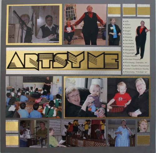
This is it! This is my first Mosaic Moments Design Team project. I decided on a single-page project because I didn’t want to get carried away. In other words, if it was more than one page it could easily have ended up being a whole scrapbook instead of a two-page layout!
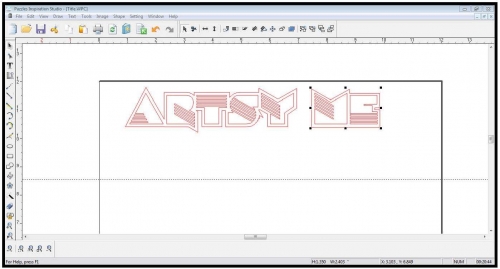
It took me about a week to settle on a my title -- “Artsy me.” Now, before I talk about the title, I need to share this one little thing . . . and I can share it here because I’m absolutely confident that my husband will never ever trip onto Journella and see what secrets I’m spilling here. When I got the design team notification, I knew that I wanted to stretch a bit and redefine my toolbox when it comes to creating designs and layouts. That meant, for me, not relying on cartridges and SVGs or MTCs to create my designs. I wanted to do my own! That meant I needed to upgrade to a different diecutter. At first I thought I would get a Silhouette, but I quickly discovered that a Pazzle would better suit my needs. So, I got one. Of course, I failed to immediately mention my latest acquistion to my husband . . . well, I did mention it when he wasn’t paying attention, but that’s a story for another time. I was finally able to share my vision for the Pazzle’s role in my artistic endeavors on December 20th after my husband went out for a doctor’s appointment and came back six hours later with a new car . . . So, here I am, reading the instruction book to my semi-secret new tool and trying to figure out how to make this thing work! Suddenly, I found the perfect artsy font: Consigna Font! It spoke to me as clearly as those silly little knick-knacks do on the Ikea commercial. So I carefully followed the directions and cut it!
That done, I faced an even bigger challenge! Do you know how long it’s been since I’ve done a screen shot? I think it may have been in the late 80s or early 90s! I couldn’t even find the print screen button on my laptop! It’s not a keystroke I use, obviously. After a long trek through the black-and-white jungle, I found the function snuggled under the home key. Sadly, it didn't seem to work. I finally gave up and hit F1 to see what Microsoft had to say about my screen image. It sent me to the Paint program which didn’t seem to accept my cut-and-paste attempts. . . so I accidentally opened a Word document. You’ll never guess what I found there -- on the insert tab next to the chart element is a “screenshot” button. My life was complete – and here’s how it turned out.
What a victory! Once my Pazzle cut the image, I fed my die-cut title into my Xyron 1.5” sticker maker. Then I began the “what-if” search for how to present it on my mosaic page. I considered my options – printed paper, glitter, flocking, and more. Suddenly I found the perfect medium -- some American Craft Foil Paper I bought at AC Moore about four years ago. The next problem – color Now, I want you to know that I’m a gold-kinda-girl. My wedding ring is gold, trimmed in onyx. I wear gold earrings, and I like gold jewelry in general. So why do my current, ex and future daughters-in-law prefer silver? I mean silver’s nice, but gold is GOLD!
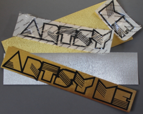
So, to honor indecision, I decided to incorporate both colors into my title and subsequent 1” square embellishments.
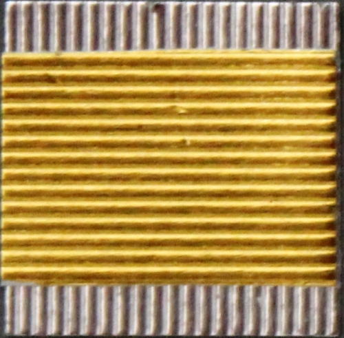
Oh! And of course there’s the color of Mosaic paper. I opted for Pewter because it offered a softer backdrop for Artsy Me than black or white. 
Once I finished my titling, the rest was a piece of cake, sort of. I can’t say that the photos convey the artsy story I hoped for, but they do present a performing-arts collage of sorts. These photos cover about five or six years and are but the tip of the iceberg of my artistic endeavors and geography. I write and produce Christian audio plays that we perform in prisons, with homeless shelter clients, and in churches. I also minister through audio theatre and storytelling on the mission field. Not only do I teach others how to do what we do (directing), but I’ve been known to preach from time to time – in this case both in Granada and Trinidad, West Indies. So that’s one side of artsy me. I am also a writer and have taught classes at several writers’ conferences. Best of all, I’m a grandmother of three – the two youngest are shown in this first project. Instead of narrative journaling, I created a list of the various creative callings in my life. They are listed in by length instead of order of importance.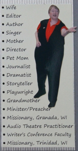
My husband used to tell people that God stuck this funnel in the top of my head and keeps pouring ideas in it . . . even when I was in the Air Force, the artsy or creative side of me hovered in the forefront, refusing to be ignored. So, for me, recognizing and preserving the creative me in a highly pragmatic environment continues to be my challenge. I have a few years under my belt and am thoroughly intrigued about the “what’s next” that promises to unfold in the road ahead. I’m looking forward to getting to know everyone on the design team and to rise to the challenges 2013 promises to present.


